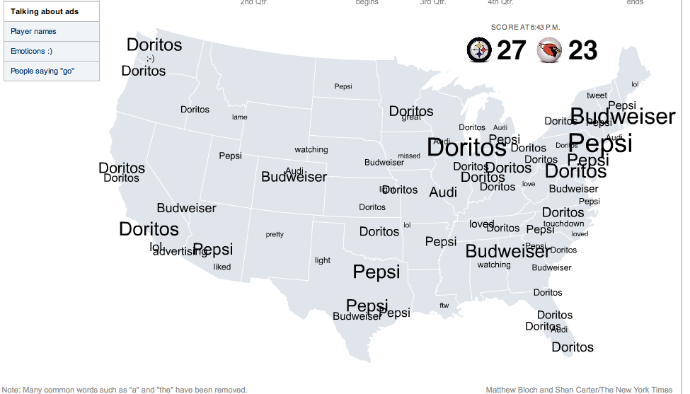
Data visualization can do so much to simplify the complex, so was very excited to see this amazing interactive timeline mashup of Superbowl Tweets on NYtimes site. The creators kindly even put a separate stream just for the ad mentions and the Audi spot I wrote about yesterday got noticed.
I think the IP settings for individual states in the US ensures this type of map is accurate, much harder to do in Australia apparently.

Brand names get tweeted – A LOT 🙂
It is such a spectacular way of tracking brand engagement – via Twitter, and can give any brand investing in media placement during the Superbowl some piece of mind (or not!).

Web trends data visualization
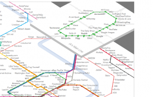
I am also standing by for my other favourite piece of data visualisation – the Information Architects Web Trends Map 4 is due in February – currently a preview available The previous Web Trends Map 3 show you what a spectacular job the IA people do. They take the web’s trending companies/channels/platforms and map them onto a Tokyo subway system.
Ordinary (non-digital) humans think this is like some kind of voodoo – I had last year’s map 3 above my desk and it was an endless topic of conversation of what it meant and what it was a picture of. I was branded a hopeless nerd, but even the luddites were seduced by the power of sexy data visualization. Stay tuned for version 4.0 which will be available soon from IA – in the meantime you can comment on the preview list and help shape the map.